Rachel Dembeck

General | Wednesday June 16 2010 2:58 pm | Comments (0)

rachel_dembeck_2b1
Student Artist: Rachel Dembeck
Software Used: Adobe Photoshop
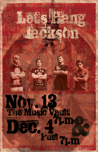
This project again had a specific requirement, I had to find a local band and create a poster for them (non profit) I had a lot of help from Mr. Lawrence in finding a band. Once I found them we talked back and forth on what they wanted. I used several different images layering them to get a desired effect. I wanted the poster to look older and textured like crinkled paper it took several attempts to achieve it.

Luis Santos

General | Wednesday June 16 2010 2:55 pm | Comments (0)

luis_santos_6b1
Student Artist: Luis Santos
Software Used: Adobe Illustrator, Adobe Photoshop
This was created with Adobe Illustrator’s gradient mesh tool and later enhanced in Photoshop.

Luis Santos

General | Wednesday June 16 2010 2:52 pm | Comments (0)

Luis-A-Santos-1A-2010.indd
Student Artist: Luis Santos
Software Used: Adobe InDesign
My goal for this design was to create a simple and elegant spread for a travel and leisure magazine. I chose to create a design with lots of negative space and muted colors to show the appearance of a calm and enjoyable trip to South America.

Luis Santos

General | Wednesday June 16 2010 2:24 pm | Comments (0)

luis_santos_4b1
Student Artist: Luis Santos
Software Used: Adobe InDesign
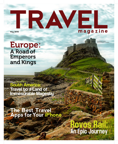
This design is for the cover of a traveling magazine. The goal for this design was to create a simple but effective cover that attracts people. I decided to use an amazing photograph of the main article in the magazine for the cover. I also decided to align some of the featured articles in the magazine to key places where it would be readable and not affect the main photograph.

Jamie Petkosek

Graphic Design | Wednesday June 16 2010 2:20 pm | Comments (0)

Package Design
Student Artist: Jamie Petkosek
Softward Used: Adobe Illustrator
For this assignment, I re-designed an existing box for Wheatsworth crackers. I intended to make the product look healthier by emphasizing its natural elements and using a more appealing color scheme of gold and red.
I painted the bundle of wheat on front in Photoshop to portray a “hand painted” appearance and imported it into Illustrator. I chose red for the wrap around the wheat to help it contrast against the rest of the image and put the product’s name in focus. I chose this particular font for the product’s name since it echoed the flowing, organic quality of the wheat. In the background, I kept the colors and shapes simple to add visual interest while still keeping the focus on the wheat bundle. On the back, I added some individual wheat shapes to guide the eye around the design and to connect the foreground with the background.

Jamie Petkosek

General | Wednesday June 16 2010 2:16 pm | Comments (0)

JaimieP_bookcover
Student Artist: Jamie Petkosek
Software Used: Adobe Illstrator
Going with the Art Deco era’s prevalent theme of machines, I chose to depict a train. I used a color scheme of black, brown, and blue to mimic the Industrial Age. The dark browns and blacks communicate the hard machinery, while the soft blues and ivories lighten the overall feel of the piece and inject some optimism into what otherwise would be a cold design. I added the streak of red on the train to unify and suggest movement. The large brown shape at the bottom complements the train with its angle and balances out the design. I drew the train on the front from a low angle to make it look more powerful and to mimic the exaggerated angles often used in early Art Deco pieces. The black gradients on the train helped create the look of steel and suggest movement, as if the train is zooming by. I added the curvy shape of the smoke cloud to introduce some contrast against the straight lines of the train and to add some interest to the sky by breaking up the plane of open space.

Gian Soriano

General | Wednesday June 16 2010 2:09 pm | Comments (0)

gian_soriano_1b
Student Artist: Gian Soriano
Software Used: Adobe Illustrator, Adobe Photoshop
My goal was to recreate a packaging design for the product “Nesquik”. I wanted to make a portable “on the go” packaging for it to make it easier for the consmers to bring it anywhere. I’ve seen a lot of different companies like Kool-Aid, Starbucks, etc. that are making packages like these so I thought it would be a great idea to make one for the powdered Nesquik sine they always came in either a can or a plastic container. Consumer’s could then bring this product with them anywhere without much hassle.

Christopher Green

General | Wednesday June 16 2010 2:04 pm | Comments (0)

christopher_green_3b
Student Artist: Christopher Green
Software Used: Adobe Photoshop
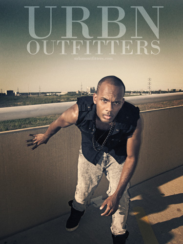
My goal was to create a visually interesting magazine advertisement that would immediately capture the attention of the viewer. Urban Outfitters regularly features their clothes on models in outdoor environments. I continue this trend with my design. The sky and the field in the background are prominent within the image. I also introduce hints of industrialism with the concrete barrier and the metal pipe behind the subject of the image. When it came time to introduce the textual elements of the design, I ran into a problem. The position of the skyline did not allow for the text to fit at the proper size. I had to actually reconstruct the horizon in order for the sky to appear larger. This allowed me to fit the text and it also improved the overall look of the image. Various filters and adjustments were used to de-saturate the image, bring focus to the model, and make the sky a bit darker.

Rachel Dembeck

General | Wednesday June 16 2010 11:31 am | Comments (0)

rachel_dembeck_2b
Software Used: Adobe Photoshop
This project again had a specific requirement, I had to find a local band and create a poster for them (non profit) I had a lot of help from Mr. Lawrence in finding a band. Once I found them we talked back and forth on what they wanted. I used several different images layering them to get a desired effect. I wanted the poster to look older and textured like crinkled paper it took several attempts to achieve it.

Christopher Green

General | Wednesday June 9 2010 12:09 pm | Comments (0)

chris_green_1b
Student Artist: Christopher Green
Software Used: Adobe Photoshop
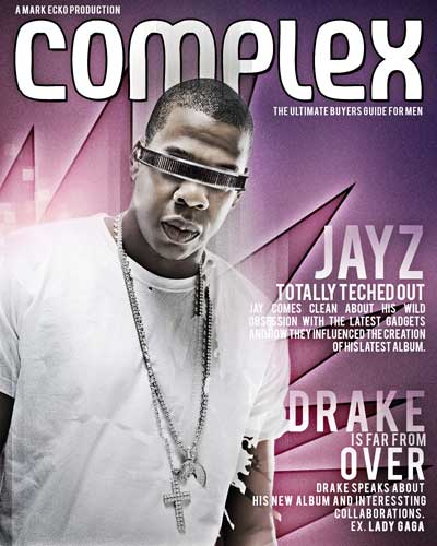
Complex is a magazine for men that features the latest in street wear fashion, sneakers, gadgets, and music. My goal was to create an original cover that represented Complex with respect to its previous covers and also incorporate my own unique vision. Jay-Z was chosen as the subject of the cover. His image conveys a since of power grabs the viewers attention.  Incorporating the futuristic Star Trek glasses into the cover lent itself well to the comedic elements that Complex is known for, without making the subject look foolish. They also give the viewer a hint as to what the cover story is about. Photoshop was used to mask the subject, as well as the glasses, from their respective backgrounds.
The combinations of dark violet, magenta, and yellow, were used to portray a feeling of energy without resorting to bright neon colors that would not only misrepresent the subject but also distract from it as well.